

You are using an out of date browser. It may not display this or other websites correctly.
You should upgrade or use an alternative browser.
You should upgrade or use an alternative browser.
Moi dix Mois new album "D+SECT"
- Thread starter Garnet in the Eden
- Start date
- Status
- Not open for further replies.
Amatsu
-member-
- Joined
- Jan 1, 2006
- Messages
- 4,576
I don't think so.Berserk wrote:Did anyone answer where that second pic came from?
It seems fan-made to me, but the photoshopping on mana's shit has gotten shittier over the years, so, I also wouldn't be surprised if it wasn't.
I mean, look at the FIRST promo image. XDD If I had made that in photoshop I wouldn't ever show a soul.
what for a 2nd one???
- Joined
- Jan 30, 2007
- Messages
- 2,506
myu wrote:@Iskanderia thank you XDD yeah I tend to keep it tasteful when it comes to that anime sense...
Look, anything with big eyes and pointy chins is anime to me. Including Kate Hudson and Reese Witherspoon.
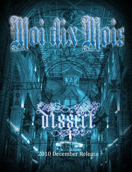
Sorry, I made that flyer...
It was supposed to be a joke with the title change, but since everyone thought it was real I decided to leave it alone for a while as an example of how easy it is to make a convincing M10M flyer.
But yeah, don't worry, it's still D+Sect or whatever.
Also, the picture overlay thing is from a set of Necronomicon brushes I got on DeviantArt, and the title font is Middle Saxony text with a gradient overlay and some stupid bevel effects.
So now the real question is, who's flyer is better (or suckier if you prefer)?
LOL I'm glad I didn't post it on tumblr xD it would have made a snowball effect xD
Amatsu
-member-
- Joined
- Jan 1, 2006
- Messages
- 4,576
Lempicka wrote:LOL I'm glad I didn't post it on tumblr xD it would have made a snowball effect xD
YOU REALLY SHOULD HAVE xDDD
Iskanderia wrote:myu wrote:@Iskanderia thank you XDD yeah I tend to keep it tasteful when it comes to that anime sense...
Look, anything with big eyes and pointy chins is anime to me. Including Kate Hudson and Reese Witherspoon.
/dead.

Cerceaux's flyer is more 'dix'.


I think the teaser poster is pretty lame so I re-designed it, too. I don't think it's cheesy enough for Mana, though.
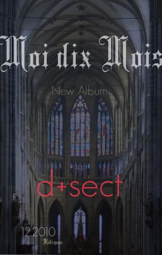
I can't imagine MdM using such a round font xD
- Joined
- Mar 23, 2007
- Messages
- 3,993
yeah and the text is too unreadable, it doesn't have a gothly glow.Lempicka wrote:I can't imagine MdM using such a round font xD
That just looks like a classical teaser. If anything classical would ever be called d+sect.

")
Judging by the font, what will happen to everyone credited in the booklet?

- Status
- Not open for further replies.